For over a decade, Mobile-First Design has been the rallying cry of modern web development, shifting our focus from desktop behemoths to the essential experience on a small screen. In 2025, with over 60% of global web traffic still mobile-driven, this strategy isn't just a best practice—it’s the foundation of good UX, SEO, and business viability.
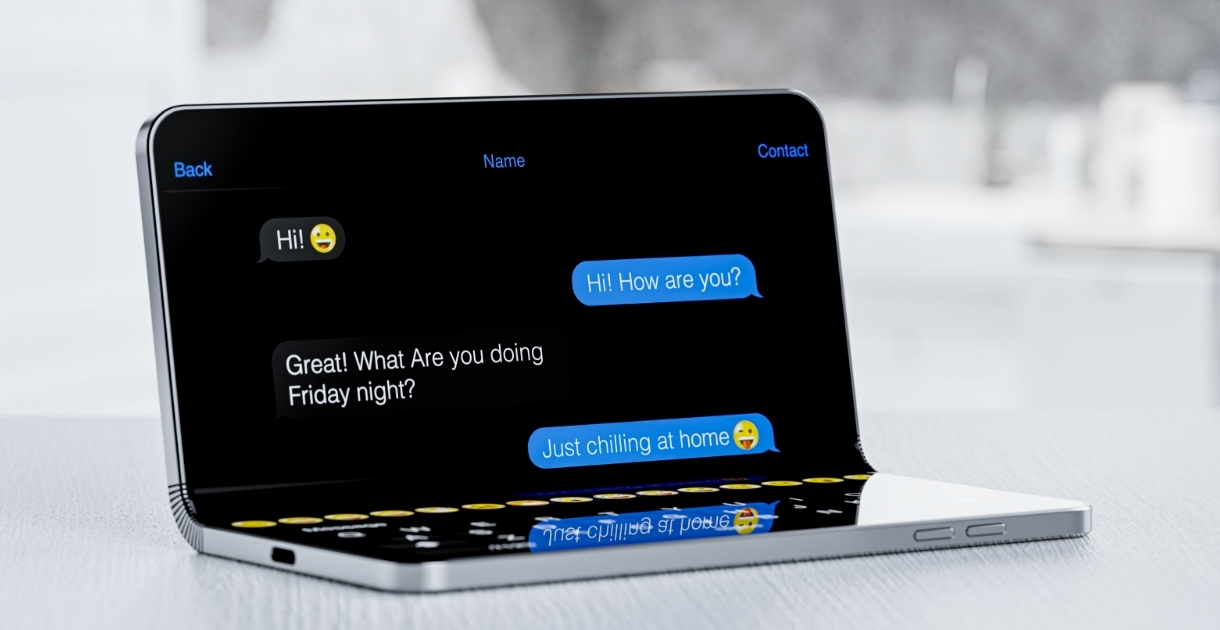
But the "mobile screen" is changing. The rise of foldable devices—phones that seamlessly transition into tablets—is forcing us to evolve the very definition of responsiveness. It’s no longer enough to scale a layout up; we must design for the unfolding experience.
Why Mobile-First Still Reigns Supreme
The core principles of Mobile-First are more relevant than ever. By starting with the most constrained environment, we're forced to ruthlessly prioritize.
- Content Priority: Limited screen space demands we focus on the most critical information and calls-to-action (CTAs). This creates a clearer, less cluttered experience for users on all devices.
- Performance: Mobile users often have slower connections. A mobile-first approach naturally leads to leaner code, optimized images, and faster load times, which is a huge win for user retention and Google's mobile-first indexing.
- Touch-Friendly Design: Designing for the thumb and finger—using large, well-spaced tap targets—ensures high accessibility and intuitive interaction, a principle that carries over perfectly to larger, touch-enabled foldable screens.
The Foldable Phone Revolution
Foldable devices like the Samsung Galaxy Z Fold and Google Pixel Fold are no longer a niche curiosity; they represent a significant market trend, especially in the premium segment. For web designers, they introduce two critical, dynamic screen states: the small, narrow cover screen and the large, square-ish inner screen.
The challenge is the smooth transition between the two. Users expect a continuous experience when they fold or unfold their device, a concept known as Screen Continuity.
Designing for the Unfold
Adapting to this dual-mode device requires going beyond traditional media queries:
- Embrace Multi-Pane Layouts: On the inner, tablet-sized screen, don't just stretch your mobile layout. Utilize the space for enhanced productivity. Think master-detail views—like a full email inbox on the left and the message content on the right.
- Hinge-Aware UX: The crease (or the hinge area) is a natural split point. Design key interactive elements, like navigation bars or primary CTAs, to avoid landing directly on the fold.
- Container Queries are Your New Best Friend: Traditional media queries react to the whole viewport. Container Queries (now supported in modern CSS) allow components within your layout to adapt based on the size of their immediate parent container. This modularity is essential for building flexible elements that can fluidly shift from a narrow card on the cover screen to a wide-panel component on the inner screen.


